Virtus
Do more with the team you have.
Virtus is a centralized job management platform that helps B2B teams streamline
operations and get more done with the people they already have.
The rebrand draws inspiration from the precise geometry of snowflakes and the vibrant energy of the aurora borealis—natural wonders that combine delicate structure with bold, luminous movement.
Like a snowflake, every Virtus deployment is unique, yet built from perfectly connected parts. The aurora adds a spark of electric colour and dynamism, reflecting the platform's ability to energise and unify teams.
This natural metaphor brings clarity and warmth to complex operations: resilient like winter evergreens, pure as glacial ice, and alive with innovative light. The result is a confident, approachable brand that turns efficiency into something elegant and empowering.
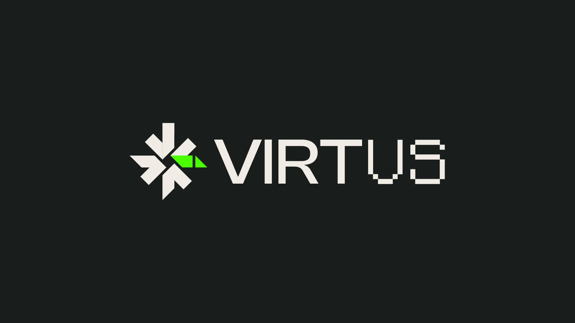
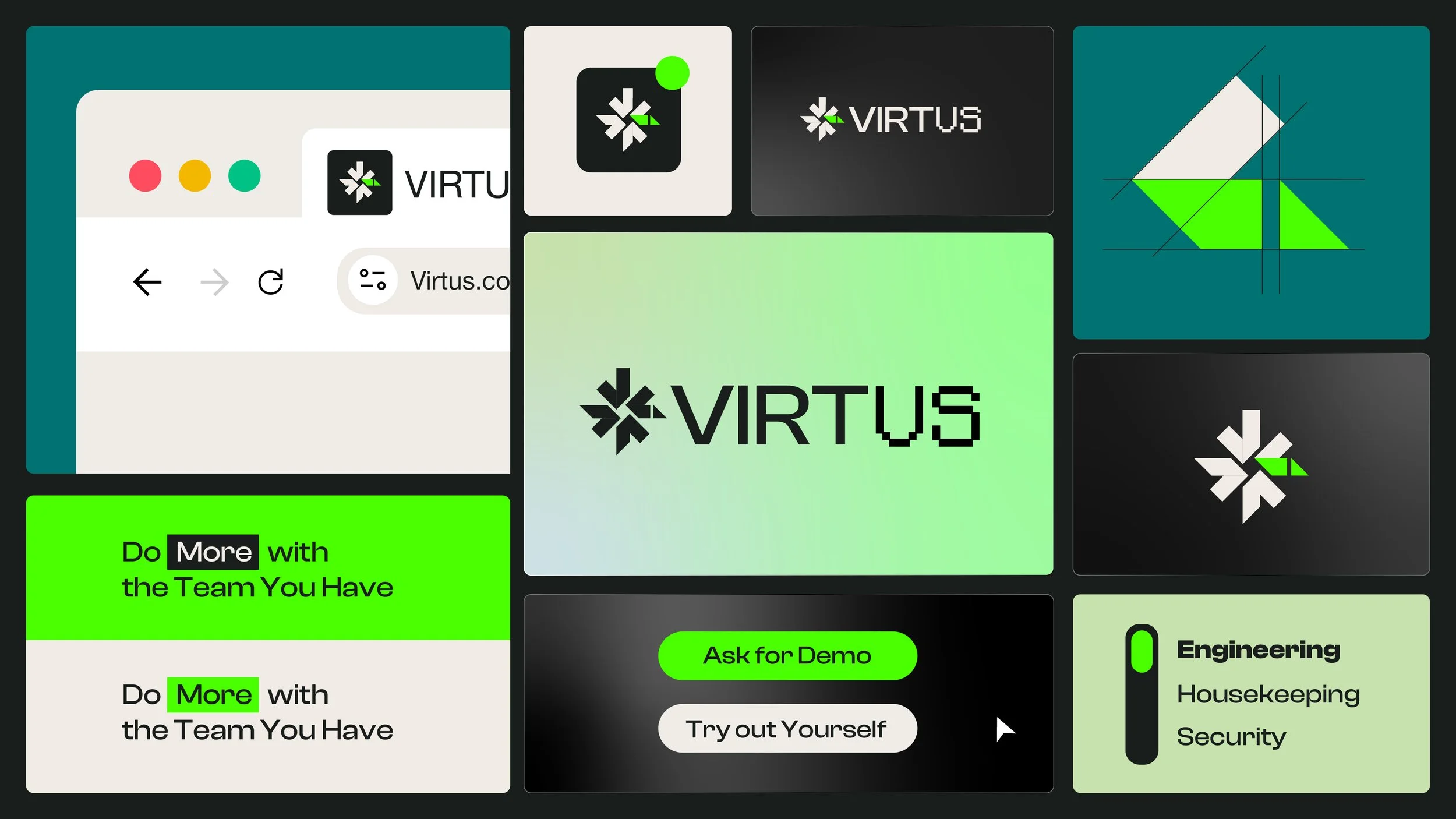
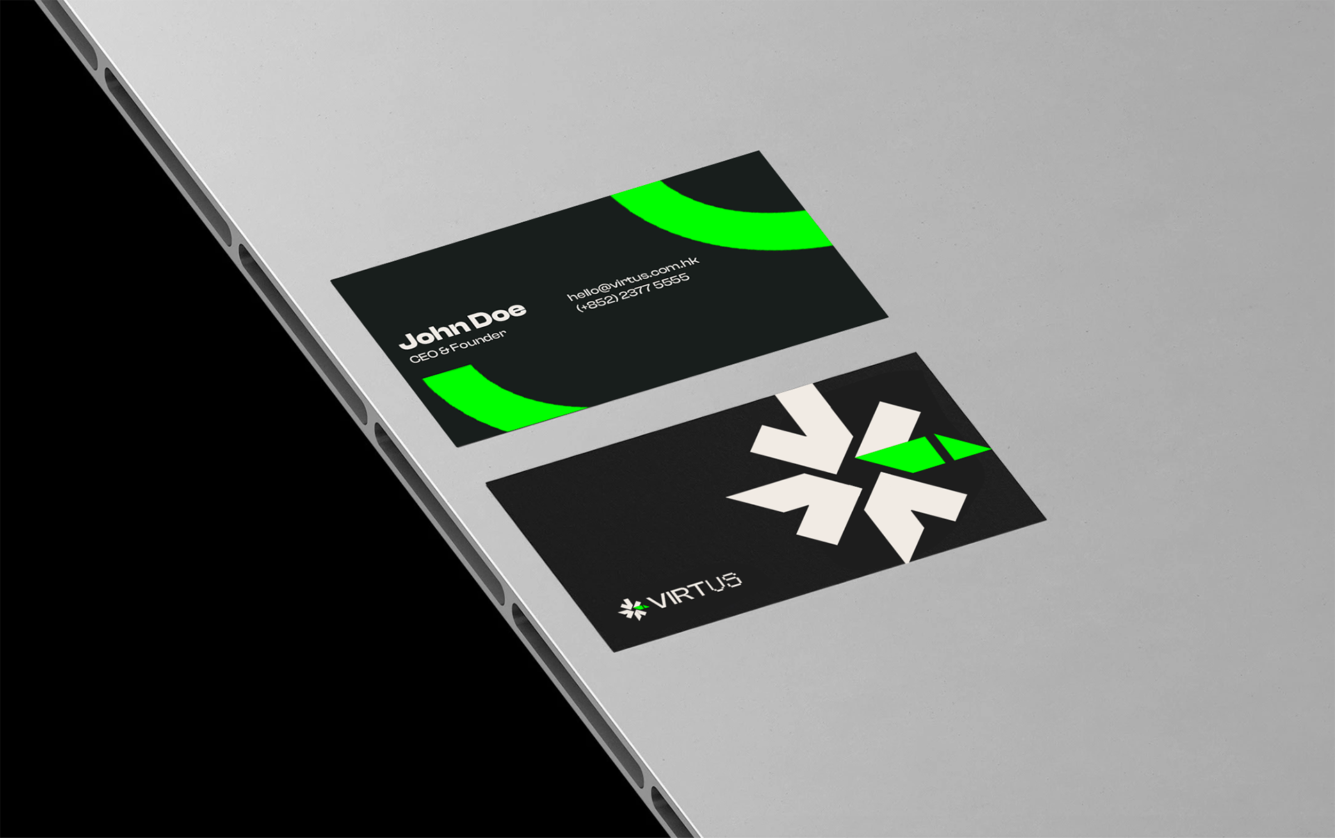
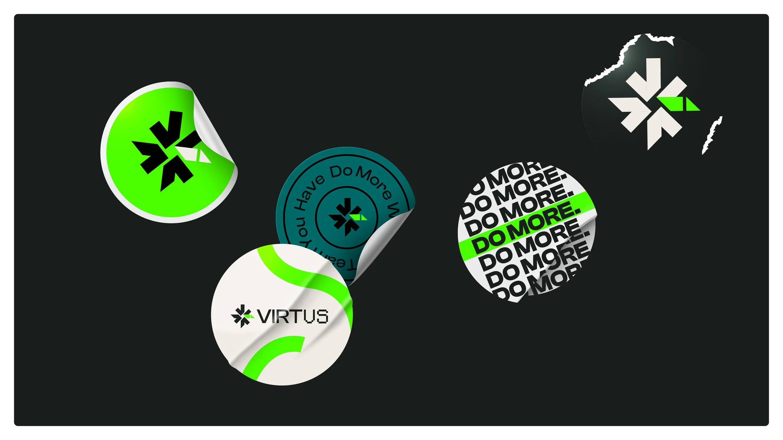
The Virtus mark - a geometric starburst in black and green captures snowflake precision with auroral glow. Bold typography drives the message: "Do More with the Team You Have." Calls to action pulse in lime green, inviting engagement. The identity feels alive and unified, turning tools into symbols of team empowerment.
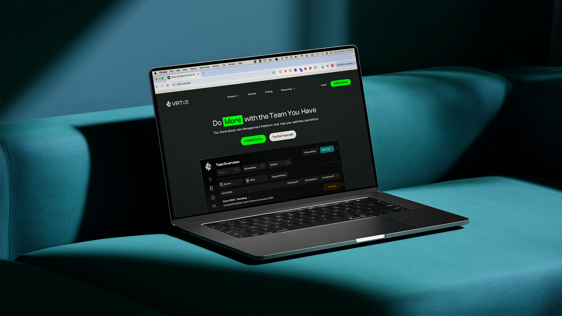
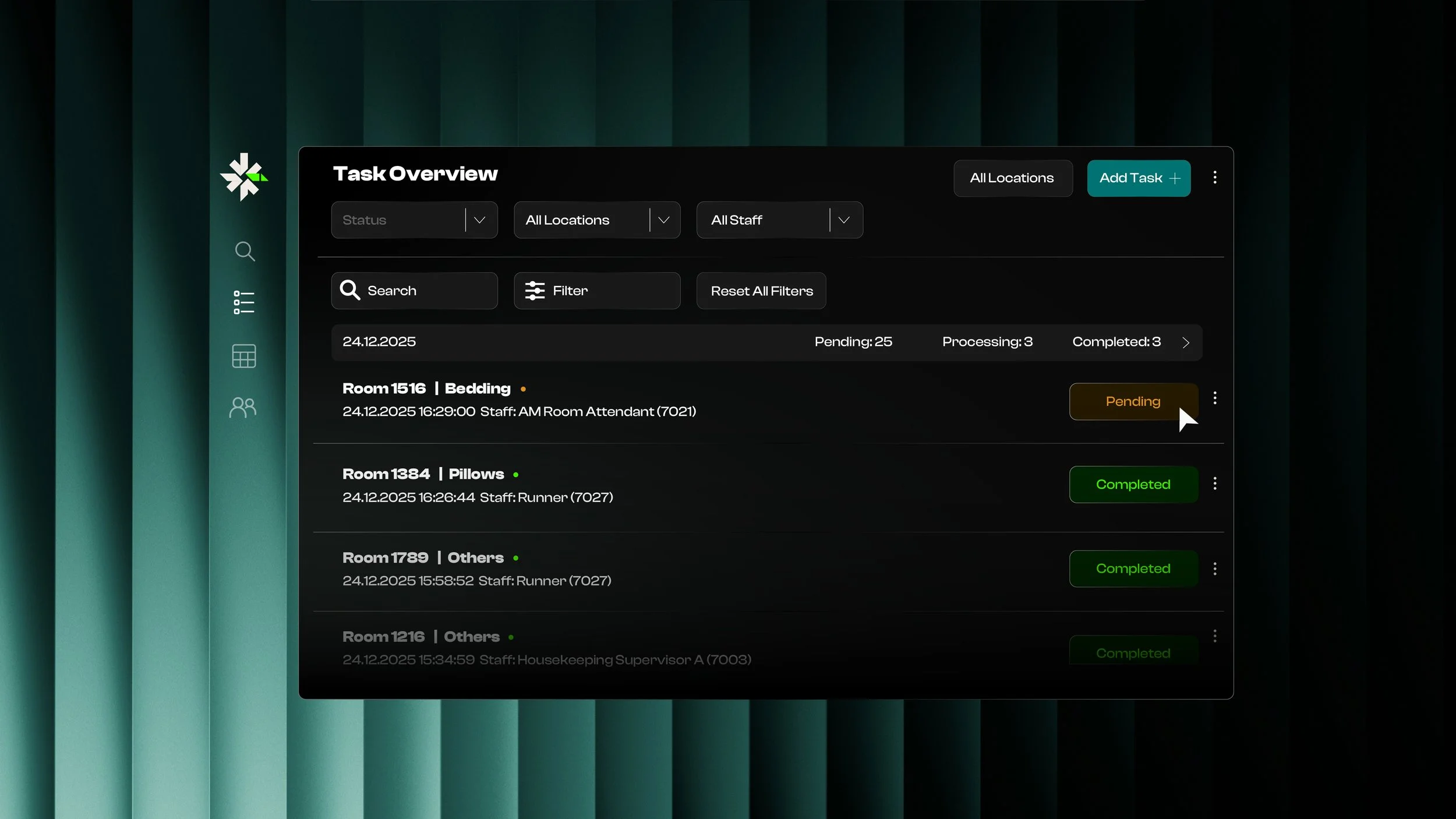
Virtus brings calm precision to daily tasks. The dashboard echoes snowflake symmetry - the tasks flow clearly, empowering staff to stay in sync. it's energizing teams for seamless operations.
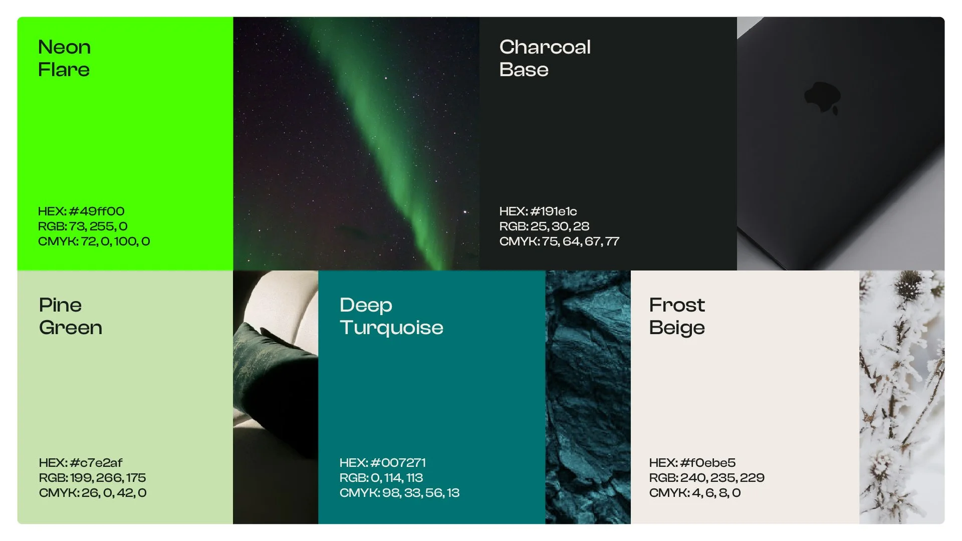
Drawn from auroras and winter landscapes, the palette balances vibrancy and calm. Neon Flare sparks energy, Charcoal Base provides depth, Pine Green evokes resilience, Deep Turquoise adds flow, and Frost Beige offers pure neutrality. These colours create a dynamic yet structured system, adaptable for any team.